When creating tactile coordinate systems and graphs, several key factors should be considered to ensure the final product is useful and accessible to braille readers. Here you will find an overview of the most important things to keep in mind, including:
Simplicity and Size
Tactile drawings must be simple and in the right size. It is a good idea to study drawings made by the producer (for example a national resource centre for braille readers) to get an idea of how they should be made. Also, engage in a dialogue with your braille reader to understand how they read and comprehend tactile images, and inquire about their preferences. The adapted drawings must always suit the student’s ability to read such images.
Avoid Perspective
Never use perspective in tactile drawings. 3D figures must always be presented as concrete material. A longitudinal or cross section may alternatively be presented in a tactile drawing.
Maintain Consistency
It is an advantage if the tactile drawings are uniformly designed over time, for example always use the same structure for the coordinate system. Consistency in design allows the braille reader to recognize the image more quickly, enabling them to focus on the mathematical part of the task.
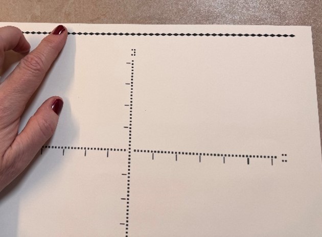
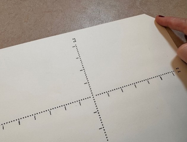
Use a Northern Line for Orientation
Consider using a northern line (a tactile horizontal line at the top side of the drawing) to help with the orientation of the drawing. It is especially important when the tactile images are presented on loose paper, and don’t have a cover or bound booklet. Ensure that the paper is positioned so that the north line is horizontal. On a swell paper or embossed paper, you can use a dotted line as northern line. An alternative is to cut off the upper right corner of the paper.
Positioning of Braille Characters
All braille characters must be written horizontal in the drawings. If single letters are used, the position in the braille cell must be clearly stated for example by using a full braille cell.
Labels and Arrows on the Axes
- Arrows to mark the direction of the axes do not give any extra information and should be left out.
- The labels on the axes, for example x and y, should always be placed at the same spot so it is easy to find. For example, put the x at the same horizontal level as the x-axis and the y just above the y-axis.

- If the labels are longer text (for example “miles per hour”), put it in a key. The key should always be put in the same place on the drawings, for example at the left top corner. The text can alternatively be put in a Word-document.
Numbers Along the Axes
To avoid that the numbers along the axes interfere with the axes or the graph, the numbers should be written outside the coordinate system. Usually the y-values will be written on the left side and the x-values on the bottom-line. Adding numbers on the top and on the right of the coordinate system may make the interpretation easier but takes more space. Another idea is to put numbers and small lines as markers on the left side and underneath the grid, and to add small lines as markers on the right side and above the grid.
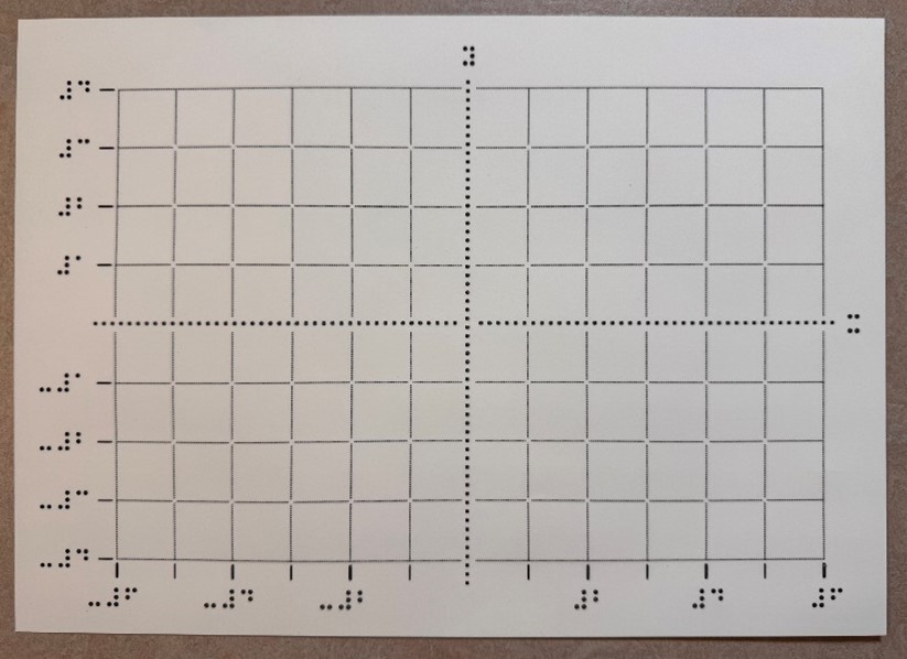
Consider whether the numbers along the axis can be omitted or if they can be described in a word document, a legenda or given as a verbal description. For example: “the step size on the x-axis equals 1 and the step size on the y-axis equals 2”.
Gridlines
- Gridlines can be marked as solid or dashed lines. The size of the grid must be connected to the tactile experience of the braille reader and the task. The distance between the gridlines should be more than 5 mm.
- Gridlines can also be marked with dots. The distance between the dots in the grid must not be more than 12 mm.

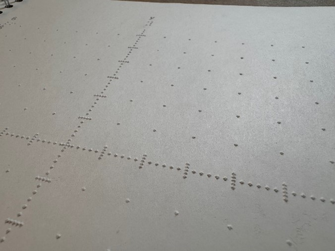
Tactile Discrimination
- The structure of the point must be easy to separate from other structures in the coordinate system. Add some open space around the point to make it easier to find.

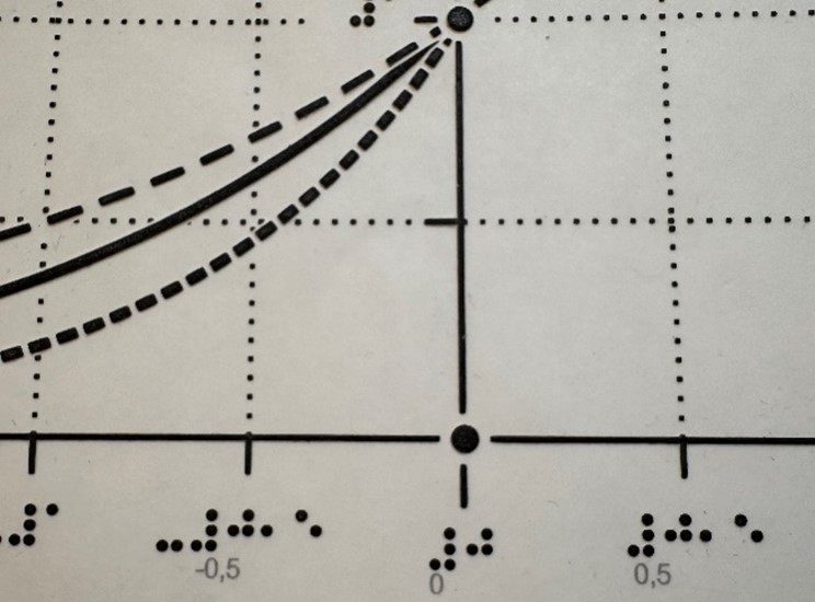
- Make sure that the structure of the axes, gridlines and graphs are easy to separate by touch. Use different tactile structures. For example, if the axes are dotted, it is best to use a thick line for the graph.
- Do not put more than three graphs in a coordinate system.
- The distance between two lines, two points or a line and a point should be at least 3 mm, for them to be tactilely distinguishable.
- Graphs that intersect or are tangent to each other at a point must have different structures. For example, solid and dashed lines.
- If it is difficult for the braille reader to separate the axes, gridlines and graphs, you could reinforce one of the structures with Wikki Stix.
- Consider removing the grid to clarify the graphs when the grid is not necessary.
- If there are several graphs in the same coordinate system, and they are placed close together, try to reinforce one of them with a Wikki Stix. Alternatively, draw the graphs in different coordinate system so the braille reader can be familiar with them one by one before studying them together in the same system.
Production Method: Swell Paper or Braille Embosser
- If the braille reader has a braille embosser, it is a fast and cheap way to print a coordinate system.
- Braille is better readable on embossed paper.
- On swell paper, it is easier to make more accurate drawings and to make better distinctions between different tactile structures.
- Details of the graphs are easier to read on swell paper.
A4 or A3 Paper
In A3 there is more space, which could make the A3 format better for complex images. But increasing the size does not always make the image easier to understand. It can be harder to get an overview.